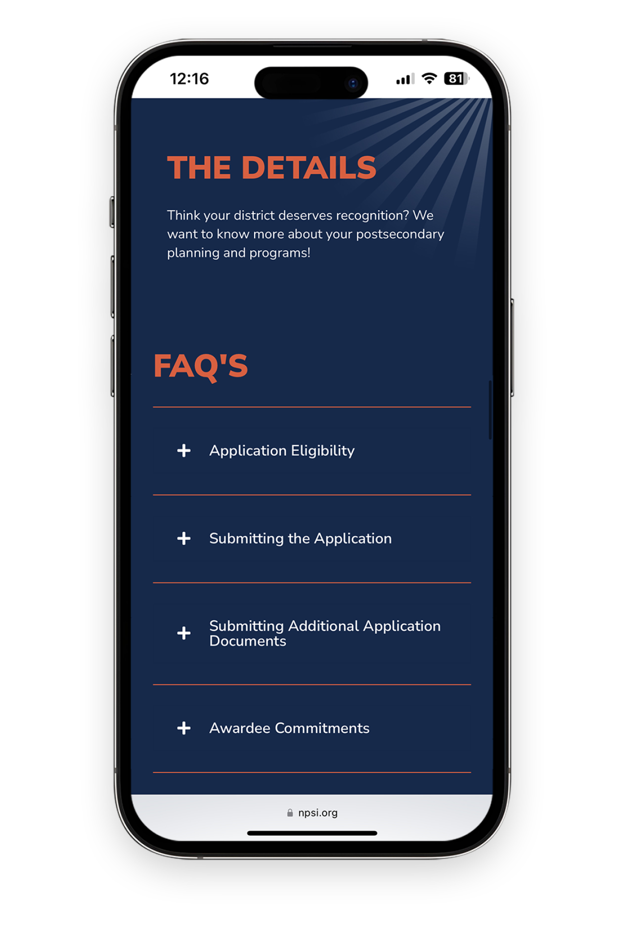
Logo Design
The logo design centers around an abstracted sunrise integrated into the letter ‘O’ of “HOPE.” This symbolic element reflects strength and optimism, perfectly encapsulating the spirit of the awards. The bold font choice communicates confidence, while the contrasting orange against dark blue reinforces the sunrise motif, conveying hope for the future.
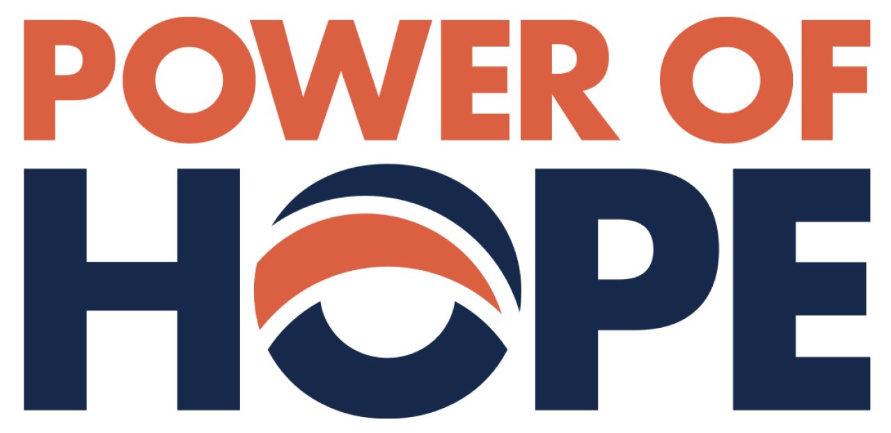
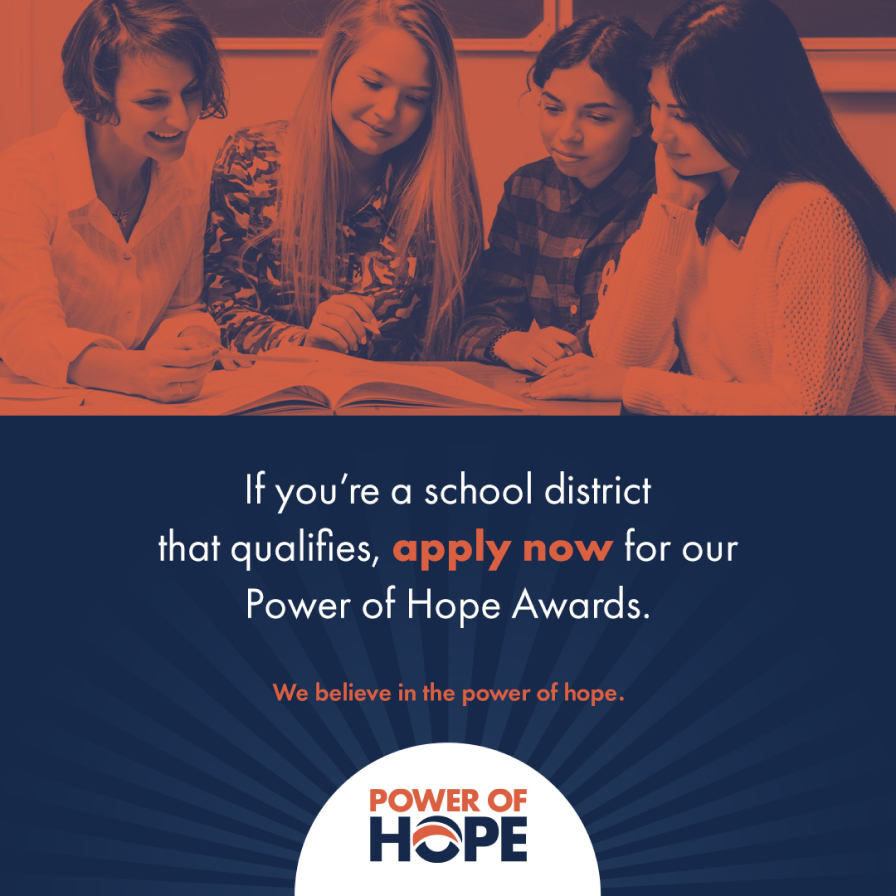

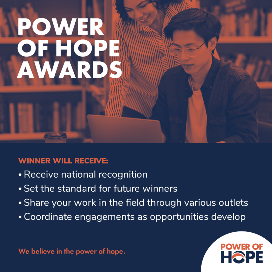
Effective Landing Page
Utilizing the Power of Hope’s vibrant color palette, we created an inviting and bold landing page. The logo’s rising sun element is referenced in the arch shapes used throughout to break up the two-column grid for a more engaging layout. CTAs were strategically placed so at any point a user decides to apply, they didn’t have to scroll far to find the application. The result is an effective landing page that communicates clearly to the user and encourages them to apply.

Target Audience
Targeted at school districts and school counselors, the Power of Hope Awards logo and landing page needed to resonate with education professionals while maintaining a sense of prestige. By giving the awards a strong visual identity, we’ve helped NPSI in their mission to celebrate and inspire excellence in postsecondary education strategies.

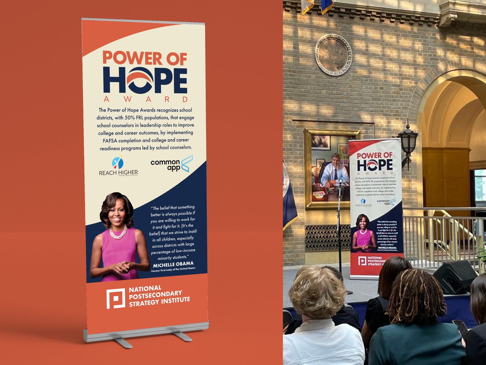
Impactful Designs
C3 Media’s work on the Power of Hope logo and landing page demonstrates our expertise in creating impactful designs that honor brand guidelines while pushing creative boundaries. This project stands as a testament to our ability to translate abstract concepts into compelling visual narratives.
